Exercise: Day 9 - Visualization
Day 9: Visualization Exercises
Getting the data for the exercises
For these exercises, we’ll be working with the TCGA Prostate Cancer Dataset. You may already have the data stored in an .RData file - if that’s the case, please load it in.
Otherwise, you can load it in with the following commands, which will produce two objects, the dataset prad and the TCGA annotations annot. These files are available for download here and here.
prad <- read.table('PRAD_normdata.txt', header=T, sep='\t', quote='"')
annot <- read.table('PRAD_SampleClass.txt', header=F, sep = '\t', quote = '"', stringsAsFactors = F)
names(annot) <- c('ID','Annotation')
Be sure to familiarize yourself with the characteristics of the data.
The structure of a ggplot
We’re going to begin by exploring the ggplot package. It contains several functions, but the basics are fairly straightforward. First, the ggplot() function is used to initialize the basic graph structure, then we add to it. The structure of a ggplot looks like this:
ggplot(data = <default data set>,
       aes(x = <default x axis variable>,
           y = <default y axis variable>,
           ... <other default aesthetic mappings>),
       ... <other plot defaults>) +

       geom_<geom type>(aes(size = <size variable for this geom>,
                      ... <other aesthetic mappings>),
                  data = <data for this point geom>,
                  stat = <statistic string or function>,
                  position = <position string or function>,
                  color = <"fixed color specification">,
                  <other arguments, possibly passed to the _stat_ function) +

  scale_<aesthetic>_<type>(name = <"scale label">,
                     breaks = <where to put tick marks>,
                     labels = <labels for tick marks>,
                     ... <other options for the scale>) +

  theme(plot.background = element_rect(fill = "gray"),
        ... <other theme elements>)
You’ll notice that ggplot is a modular grammar for describing visualizations. As you learned in lecture, the core ggplot() function is used to define the dataset you want to plot, and the geom_<geom type> defines the type of visualization you want. The package is very deep - we’re only going to scratch the surface with these exercises!
Exercise 1. Diving into ggplot()
To get right into using ggplot(), we’re going to reproduce some figures that you can make fairly easily using the base R functions. We’ll quickly see that ggplot can do some interesting things that plot cannot.
Let’s start with two very commonly used geometries - histograms and scatter plots. We’re going to reproduce examples from the Day 1 exercises, this time using the Prostate Cancer Data. As you’ll recall, these are very easy to do with base functions. We’ll now try to remake these with ggplot(). We’ll be using the histogram and points geometries.
1.a. ggplot Histograms
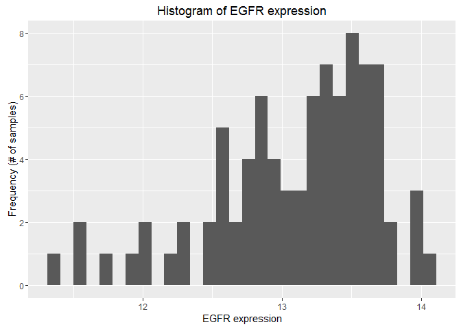
Here’s the code for the histogram you produced:
# Histogram
hist(as.numeric(prad["EGFR",]),breaks=50,xlab="EGFR expression",ylab="Frequency (# of samples)",main="Histogram of EGFR expression")

Using ggplot, reproduce the histogram. Your output should look like this:
Hint: First, make the data usable by ggplot, then construct a ggplot() with a call to the function, a geometry call, and a labs() call.
1.b. ggplot Scatterplots
Here’s the code for the scatterplot you produced:
# Scatter plot
plot(c(prad["EGFR",]),c(prad["IDH1",]),xlab="EGFR expression",ylab="IDH1 expression",main="EGFR versus IDH1",pch=20)
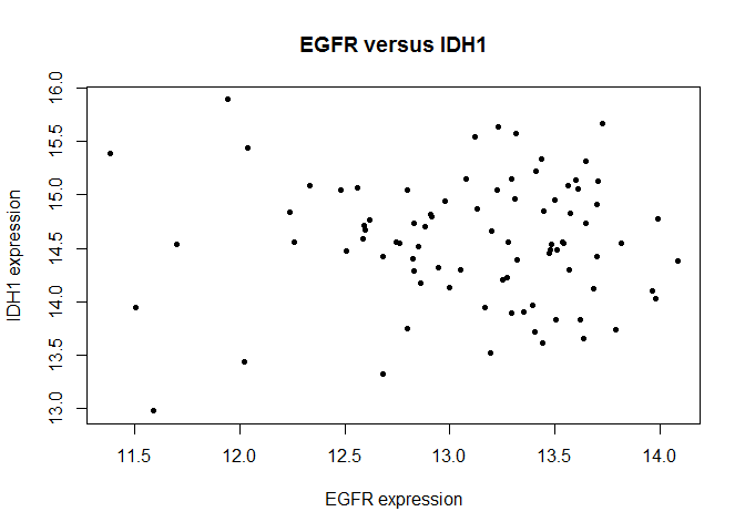
Using ggplot, reproduce the scatter plot. For this exercise, we’ll try something new that you wouldn’t be able to do with plot: color each point by whether they are primary or secondary tumors. Your output should look like this:

Hint: Perform the same steps as for histogram, but this time be sure to use your annot object as well!
Exercise 1 Wrap-up
You’ll notice that some things are easier with ggplot() and some things are harder. In general, if you’re trying to plot something you can try to do it with the base functions, but if you hit a wall, ggplot() will almost always be able to handle it.
Exercise 2. Plotting PCA and Clustering Results with ggplot
As you’ll recall from Day 6, when clustering high-dimensional data, it’s often a good idea to try to visualize how your clustering has worked out. A good way to do that is by using PCA, the dimensionality reduction tool we’ve discussed several times during the course. You’re familiar by this point as to how to perform PCA - code that does so for the Prostate Cancer dataset is below:
# Log Transform
log.prad <- log(t(prad)[,])
log.prad[is.infinite(log.prad)] <- 0 # Remove -INF values

# PCA
# Use scale. and center to normalize
prad.pca <- prcomp(log.prad, center=T, scale.=T)

# Project to new coordinates
prad.project <- predict(prad.pca, log.prad)

# Get it ready for plotting
prad.project <- as.data.frame(prad.project)
prad.project$annot <- annot$Annotation
2.a. ggplot and PCA
With the data in hand, plot the first principle component against the second and color each point by it’s primary/secondary classification. Your finished product should look like this:
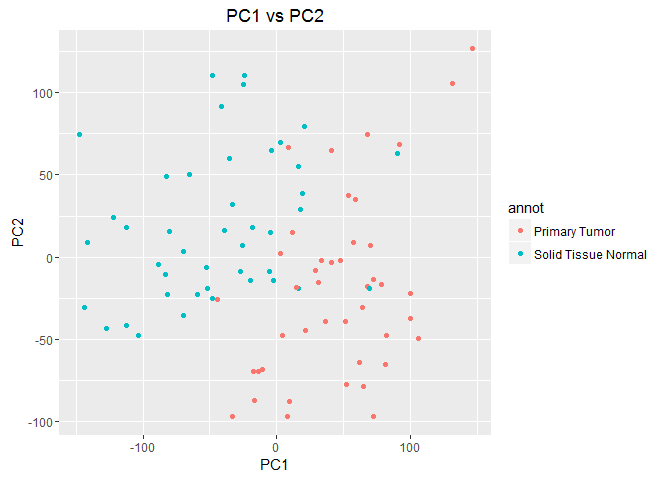
You’ll notice that the two tumor types form loose clusters based on their gene expression.
2.b. ggplot and PCA with Clustering
Now, we’re going to add another layer of complexity - we’re going to cluster the data hierarchically and overlay those results on our PCA plot. This time, we’d like the color of each point to correspond to its classification, and the shape of each point to correspond to its hierarchical cluster. I’ve provided code for doing the clustering below:
# Important to scale data before using any clustering method
scale.prad <- scale(t(prad))

# Use the `hcut` function from factoextra to perform hierarchical clustering
# k specifies the number of clusters, here, 2
hc.cut <- hcut(scale.prad, k = 2, hc_method = "ward.D")

# Add the clusters to our previous data for plotting
prad.project$clust <- hc.cut$cluster
Your finished plot should look something like this:

Hint: To change the type of shape for each cluster, use the scale_shape_manual() function added to your ggplot() call.
Exercise 3. Making your visualizations available to the public: R Shiny
Before attempting the R Shiny exercises, please watch the following tutorial videos from the R Shiny website. These videos will bring you up to speed for understanding how to complete the following exercises.
You will also need to go ahead and create a shinyapps.io account. Once you have one, you’ll be able to publish your work to the cloud and share it with your peers.
Creating an interactive visualization tool
For this exercise, you’ll be creating a shiny app for displaying a PCA projection of the data from Exercise 2.
3.a. Create your shiny application
Using R Studio, create a new shiny application: go to File > New File > Shiny Web App. This will help RStudio recognize your application and allow you to use the built-in tools to run your app. From the pop-up dialog, name your app, select Multiple File, and select a directory to put your app in.
Once you’ve created the app, you’ll need to get ready to start building. In order to get the data into a shiny app, you need to have a data/ directory in the folder with your shiny app code. Go ahead and create one, then save the prad.project data from exercises 1 and 2 into that folder as a .RData file.
3.b. Complete the app
For this exercise, you will be completing a skeleton version of a shiny app that will -Display your results from Exercise #2 -Allow users to select which PCs to display -Allow users to select which labels to add to your plot
A complete version of the application is available at shinyapps.io. To get started, copy the skeleton code for UI and Server from below. Missing parts of the apps are marked with comments.
Skeleton code for UI:
library(shiny)

shinyUI(fluidPage(
    # Layout
    sidebarLayout(
        sidebarPanel(
            # Select PCs
            radioButtons(inputId = 'pcselect',
                         label='Select PC\'s to display',
                         choices = c('PC1 x PC2','PC1 x PC3','PC2 x PC3'),
                         selected = 'PC1 x PC2'),
            # Labels or No Labels
            h5(
                strong('Display Labels?')
            ),
            ##############################
            # ADD CHECKBOXES TO SELECT   #
            # WHAT KINDS OF LABELS TO    #
            # DISPLAY                    #
            ##############################
        ),
        mainPanel(

            strong(h5(textOutput('labPCA'))),
            # Plotting
            ##############################
            # ADD A CALL TO plotOutput() #
            # TO DISPLAY YOUR SERVERSIDE #
            # GRAPHING                   #
            ##############################
        )
    )
))
Skeleton code for Server:
# Data
load('data/shiny.RData')

# Libraries
require(shiny)
require(ggplot2)

shinyServer(
    function(input, output) {
        output$labPCA <- renderText(
            #########################
            # FILL OUT THIS CALL TO #
            # LABEL YOUR PLOT       #
            # WITH THE PCs PLOTTED  #
            # AND THE LABELS USED   #
            #########################
        )

        output$reactivePCA <- renderPlot(
            ggplot(prad.project,
                   aes_string(
                       substr(input$pcselect, 1, 3), substr(input$pcselect, 7, 9)
                       )
                   ) +
                geom_point(
                    if (length(input$lab) == 0) NULL
                    else if (length(input$lab) == 2) {
                        aes(col=factor(annot), shape=factor(clust))
                    }
                    else if (length(input$lab) == 1 & input$lab == 'TCGA Annotation') {
                        aes(col=factor(annot))
                    }
                    else if (length(input$lab) == 1 & input$lab == 'Hierarchical Clustering') {
                        ########################
                        # FILL THIS OUT TO     #
                        # SET THE SHAPE USING  #
                        # CLUSTER MEMBERSHIP   #
                        ########################
                    }
                ) +
                theme_bw() +
                theme(panel.grid.major = element_blank(),
                      panel.grid.minor = element_blank()) +
                labs(
                    ###################
                    # ADD NICE LABELS #
                    # TO YOUR PLOTS   #
                    ###################
                )
        )
    })